

Planogram merchandising vs visual merchandising, and why one shelf needs one plan

A promotional endcap can pass every check on paper and still fall apart the moment it reaches stores. The category team signs off the range, the facings, and the capacity. The visual team signs off the header, the graphics, and the focal point. Both are right within their own brief. Then the display lands on the shop floor, and staff find the signage covering the products, or the shelf too tight to restock before the weekend.
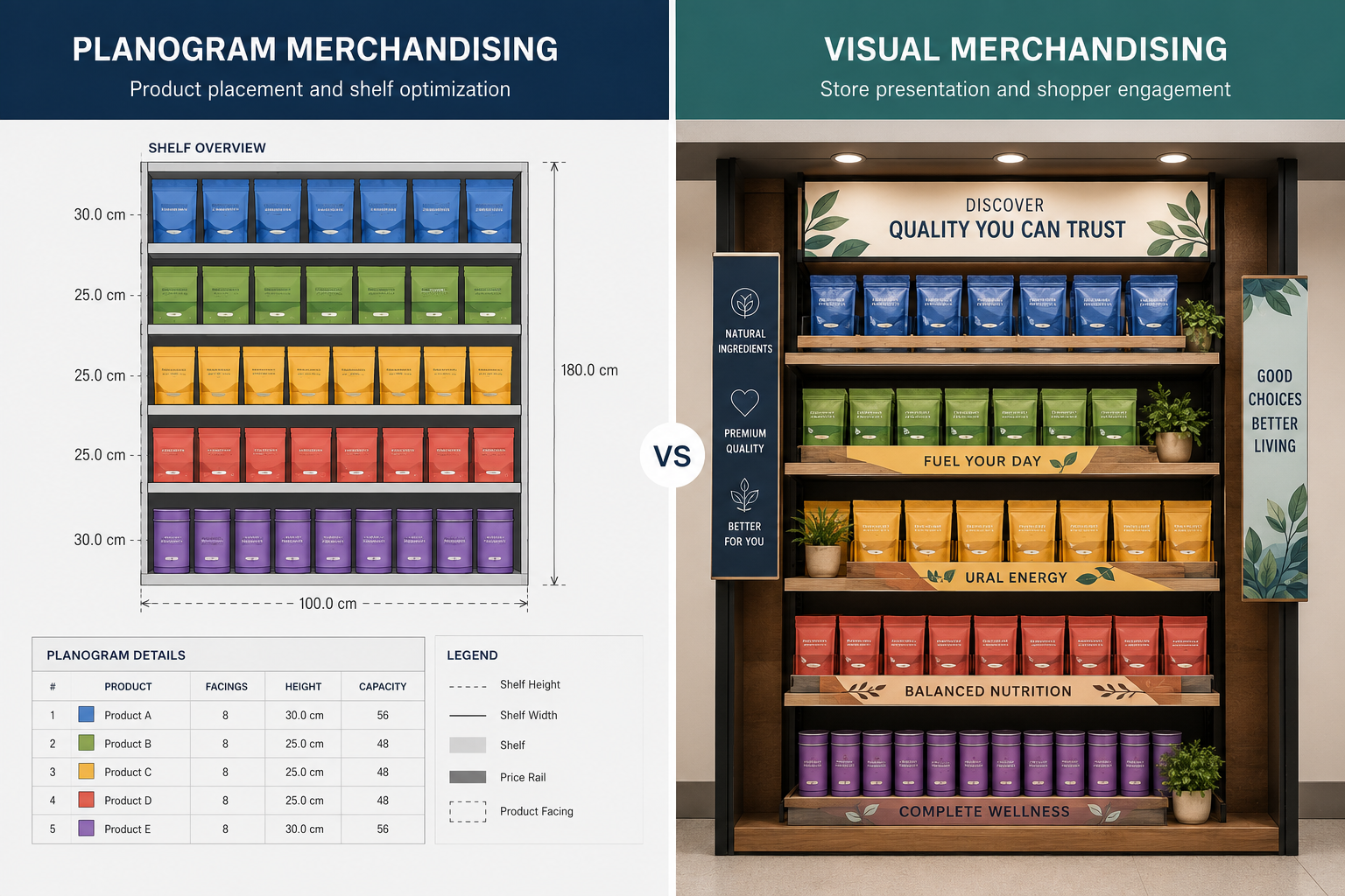
That gap between two correct plans is the real issue. Planogram merchandising decides where products sit and how much space they get. Visual merchandising decides how the store presents and communicates the offer. They describe the same physical space from two angles, and the trouble starts when each is approved on its own.
What does planogram merchandising control?
Planogram merchandising sets the product-level rules for a fixture or category. It turns range and space decisions into a layout that store teams can stock, replenish, and repeat across the network.
The decisions it owns:
- Position and facings: where each product sits and how many packs face the shopper.
- Capacity: whether the shelf holds enough stock to trade between deliveries.
- Adjacency: how products group, whether by category logic, shopper mission, segment, or brand.
- Range and space: which products earn space, and which trade-offs the category has accepted to get there.
- Fixture and format: how the layout holds up within real fixture dimensions and across different store formats.
- Availability: how pack sizes, stock flow, and restocking behave in practice, not just on screen.
These are commercial and operational calls, not cosmetic ones. A shelf can look orderly and still fail if it cannot hold demand or be restocked without a fight. Building a planogram is a subject in its own right. What matters for the two disciplines to work together is the boundary between the shelf plan and the presentation wrapped around it.
What does visual merchandising control?
Visual merchandising governs how shoppers encounter and understand the offer across the wider store. It builds attention, hierarchy, and continuity through physical presentation.
The decisions it owns:
- Focal points and displays: what draws the eye first, and how feature areas carry the campaign.
- Signage hierarchy: the order and prominence of navigation, pricing, promotional, and brand messages.
- Colour, lighting, and materials: how fixtures, graphics, and products read together as one scene.
- Seasonal and campaign presentation: how a campaign becomes windows, entry zones, endcaps, and feature tables.
- Store standards: the presentation rules that keep a campaign consistent from one location to the next.
Visual decisions weaken when capacity, replenishment, or fixture limits turn up late. A display can be striking at launch and unworkable after the first trading rush. It needs the same range, fixture, and format assumptions the planogram team is already working to.
How do planogram and visual merchandising differ?
The clearest split is the decision level. Planogram merchandising governs a fixture’s product arrangement and capacity. Visual merchandising governs how that fixture and its surroundings communicate the offer.
| Dimension | Planogram merchandising | Visual merchandising |
|---|---|---|
| Primary decision | Where products sit and how much space they receive | How the store presents and communicates the offer |
| Typical output | Planogram, fixture layout, facing and capacity rules | Display concept, signage plan, campaign standard, presentation guide |
| Accountable owner | Category, space planning, merchandising, or range team | Visual merchandising, brand, campaign, or store design team |
| Core data inputs | Range, sales, dimensions, hierarchy, stock flow, fixture data | Campaign brief, brand standards, shopper journey, store design, materials |
| Time horizon | Range review, reset, format change, or ongoing category cycle | Seasonal calendar, campaign window, launch, or store refresh |
| Store coverage | Format-specific or store-specific versions | Network standard with adaptations for format and location |
| Success measures | Capacity, availability, adjacency logic, space productivity, execution accuracy | Visibility, message clarity, presentation consistency, campaign expression |
| Execution dependency | Accurate product and fixture data, clear versions, store replenishment | Correct assets, placement, installation, upkeep, and store interpretation |
Neither discipline owns the whole store decision. Each produces a partial view of the same space. The risk appears when those views are approved separately, then combined for the first time during installation.
Where do the two disciplines overlap?
They overlap wherever products, campaign assets, and fixtures compete for the same space. The shared decision usually looks small on paper and turns material at rollout scale.
- Endcaps and promotional displays: the planogram sets range, facings, capacity, and replenishment; the visual layer sets the message, graphic hierarchy, and focal point.
- New-product launches and seasonal ranges: category teams decide what enters, what moves, and how much space the launch gets; visual teams decide how shoppers recognise it across the store.
- Campaign and retail media zones: screens, signage, and interactive displays need a real physical footprint, and their placement has to preserve product visibility and the agreed category logic.
- Store-format changes: a flagship display may rely on height, lighting, and space that smaller formats cannot give it, so both teams need to agree what stays fixed and what adapts.
A shared review keeps decision rights clear while giving each owner enough context to see the effect on the whole space.
What breaks when the teams work separately?
Separate approvals create predictable handoff failures. Both plans can be correct within their own scope and still conflict in store.
- The display cannot be replenished. A strong visual concept leaves too little working capacity, or makes routine restocking awkward.
- The planogram is efficient and hard to shop. Products fit the fixture, but the shelf lacks navigation, focal points, or breathing room.
- Campaign materials block the product. Headers, fins, screens, or signs sit in sightlines the category plan assumed were clear.
- The flagship standard cannot scale. A layout approved in a large store arrives in smaller formats with missing space and improvised substitutions.
- Versions compete. Category and visual teams issue separate files, approval dates, and change histories for one physical zone.
- Stores receive split instructions. Store teams reconcile two briefs during installation, often with no authority to decide which one wins.
Software can surface these conflicts earlier. Clear accountability, though, still comes down to named owners and an agreed approval path.
What should a shared review workflow look like?
A shared review brings product, presentation, and execution decisions into one sequence. The output is a single spatial standard with clear ownership and version control.
| Step | Review task | Decision produced |
|---|---|---|
| 1 | Confirm the category and campaign objective | One agreed business and shopper objective |
| 2 | Load the approved range, fixture, and format assumptions | A reliable base for every team |
| 3 | Review planogram capacity, adjacency, and replenishment | A workable product layout |
| 4 | Add signage, focal points, campaign assets, and visual rules | The complete presentation layer |
| 5 | Review the full space with category, visual, design, insights, and operations | Cross-functional approval or a defined issue list |
| 6 | Record decisions, owners, and version status | One controlled approval record |
| 7 | Communicate one approved standard to stores | One brief for the physical space |
| 8 | Use field evidence to identify execution issues | Feedback for the next review cycle |
Tools such as Storelab Connect can hold the planogram, fixture, signage, and display in one three-dimensional review, so teams can adjust layouts, save versions, and walk the space before sign-off. Storelab FieldForce can then compare the approved standard against store evidence, including geo-tagged photos and compliance records.
The technology makes the work visible. Leadership still assigns decision rights, resolves the trade-offs, and decides which changes need another approval round.
Which discipline should lead the decision?
The lead should follow the main risk in the decision.
- Let category or planogram ownership lead when the issue is range, capacity, adjacency, space allocation, availability, or replenishment.
- Let visual merchandising lead when the issue is campaign presentation, brand communication, focal points, signage hierarchy, or seasonal storytelling.
- Use a shared review when both disciplines change the same fixture, zone, or rollout standard. Endcaps, launches, seasonal ranges, and campaign displays usually sit here.
The practical starting point is smaller than a full process change. Before the next range reset or campaign, pull the planogram, fixture data, signage, display assets, and format variants into one review, and begin with a single disputed fixture. That one zone will expose the handoff problems before they reach a wider rollout. Storelab can bring that combined review into one place, so the standard is agreed before anything is committed in store.